Email me at
Web Templates
UI
Description
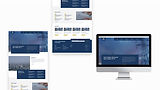
This is a collation of some of my favourite homepage concepts that didn’t get used when working for a Design Agency in London. I would onboard with clients and then use Figma to create concepts that aligned with their needs and identities. I worked closely with developers to create beautifully functioning and responsive websites.
Services
Web Design / Figma / UI
Some Problems & Solutions
When designing my concept for the Law Firm, I incorporated a double-layered tile theme running through this site. This was to try to create some striking visual depth but also it would be easy to condense responsively. I trialled some colour combinations and chose #4A4A49 (Gray), #2279BE (Blue) and #F96D31 (Orange) to act as an accent colour. These colours give that corporate feel yet together they still pop. The client went for a much lighter theme in the end even though they liked my colours, they went for a concept which has more space and was dominantly centre aligned.
When designing my concept for the Energy Company I tried to implement a blocky overlay design, this was to make the different pieces of text stand out. The colours I chose reflected a trustworthy and informative feel. This concept wasn’t chosen as the client thought it lacked a bit of flow and continuity. The deconstructed layout maybe wasn’t what they were looking for even though my design adhered to a grid.
For the Sports Recources concept, I used a brand shape to create a parallax scrolling effect. This was to give the sense of movements of differing speeds, like in athletics. I left space for a punchy hero video to immediately capture the viewer's attention. I think the client went for a 1-2-1-2 grid concept with more focus on the athletes themselves, putting more emphasis on the community side of the company. I focused more on the statical side as you can see from my infographic. In reflection I think my text alignment could have stuck to the wider margins of the site and the news section could be seen as too heavy compared to the other sections of the site.


