Email me at
Safepay
Visual Identity

Description
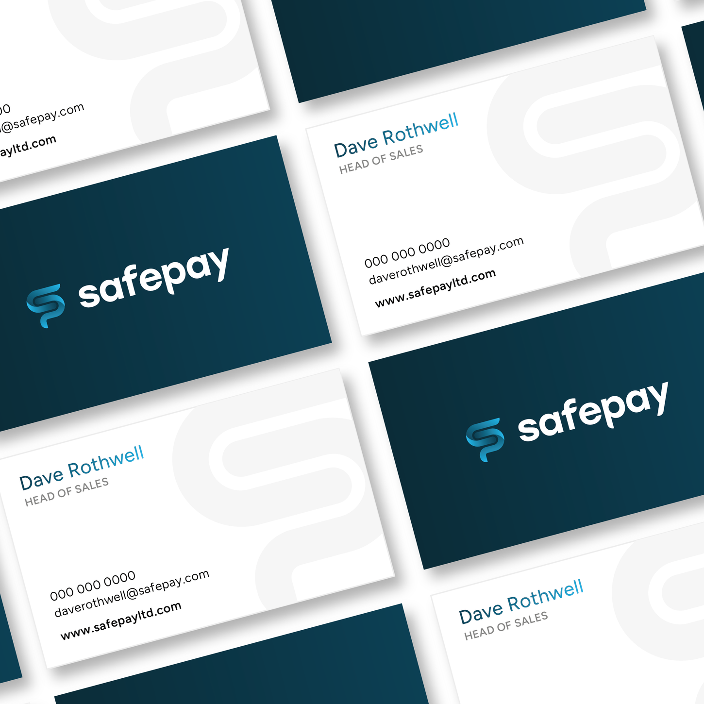
Safepay are card payment specialists who provide smart solutions and advice for business owners, whether they are Pop-up stalls or PLCs. In developing my new card payment brand, I recognised the prevailing trends in brand identities among major players in the industry and found a path through it. After crafting a coherent identity I used this to develop assets to advertise Safepay's services and business.
Services
Branding / Print Assets / Responsive Web Design / Video
Problems & Solutions
The client wanted to avoid overly abstract designs and visual similarities to existing brands. My vast journey for research led me to create a brand identity that captures the essence of innovation while maintaining a recognisable presence, reflecting the values of reliability and security that are crucial to Safeway’s ethos.
Another hurdle we had to cross was that even though Safeway is an individual brand, it works closely with the well-known brand Dojo, so we had to maintain a distance in terms of identity from them. This is seen especially in Safepay’s colours and unique logo structure with its personality being shown in the flourishes on the descenders and bars of the letters.
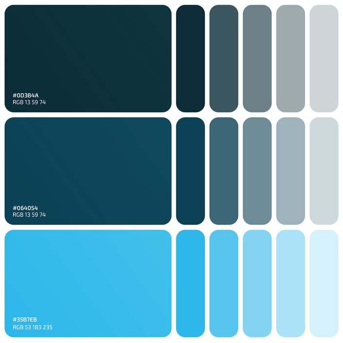
Most card payment companies rely on similar colour tones to communicate values like trust, reliability, and security. However, this trend often leads to visual redundancy in the industry. Safepay shows difference with a unique blend of blues that can be manipulated into a captivating gradient. This fresh approach not only embodies the essential values of reliability and security but also establishes a memorable brand identity.


